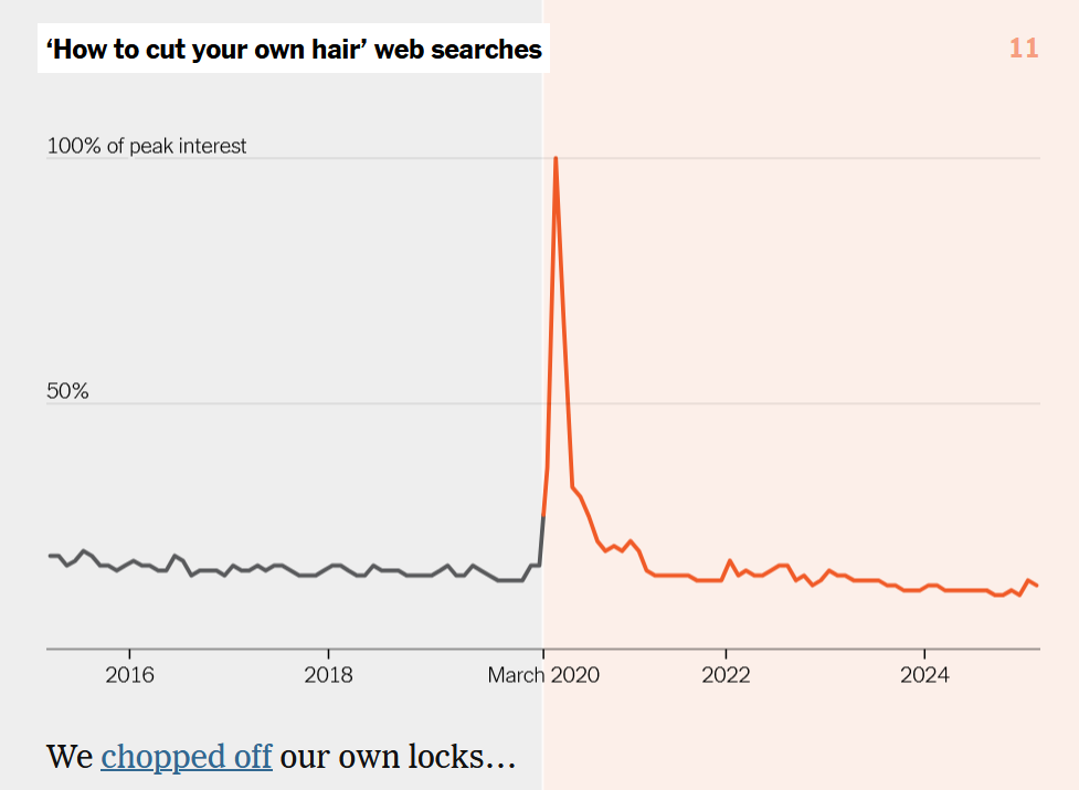
I though that is a pretty cool visualization of Covid impacts and how they have / have not normalized.
3 Likes
I guess I’m disconnected…I got the habit of getting a haircut once a year since then.
In contrast to US decaying public transit, SBB tells about a record in moving people around ![]()
The 'missing flu season` chart really shows the effectiveness of proper hand-washing, masks and isolation when contagious.

1 Like
Effectiveness against flu. But it was always known. The were posters with this information on the walls is the hospitals and some other institutions long before Corona.
The big difference with Omicron, that came and spread with a speed of light in spite of masks, hand washing, physical distance, hand washing, vaccinations and even homeoffice.
Yes, but it was still great to see a massive confirmation trial involving millions.